- Joined
- Dec 1, 2021
- Messages
- 52,722
- Reaction score
- 85,249
Does any mods know if they'll have some patch's coming to fix the mobile rendition of the site, or are we just stuck with this? It's so not user friendly it's laughable.

Does any mods know if they'll have some patch's coming to fix the mobile rendition of the site, or are we just stuck with this? It's so not user friendly it's laughable.
Does any mods know if they'll have some patch's coming to fix the mobile rendition of the site, or are we just stuck with this? It's so not user friendly it's laughable.
Its very hard to use on mobile, the text is so small, I can barely see it lol. Its much easier on my laptop as the screen is 16 inches, but my phone is only 5.5'' inches and the text is incredibly small. I'm getting old now and my vision is not what it once was, so I'm just squinting at everything.
Think I'll only be using the forums on my laptop from now on.
I know I don't have the best eyesight, but I could certainly read it clearer on my phone prior to the change
Considering some of the pointless shit that's been made into banners at the top of every page before you'd think there could be some kind of announcement or update. The communication on the 'upgrade' has been shocking.
I have to actually put on my glasses to read the screen now.
I thought I was imagining things, but the text really is smaller for you all? I'm squinting over here, but I also have shitty eyes lol.
@Digger please share the process. I am currently using the "zoom" function on Chrome (125%) only for this site, which is kind of a pain.Change the font size ... iI had the same problem
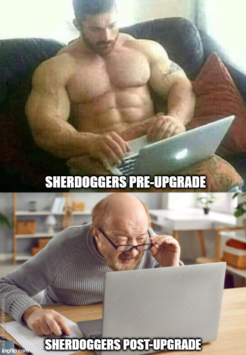
8' tall, 425lbs, 3%bf, can read Sherdog font with naked eye.looks like we're going to have to add 20/20 vision to the list of Sherbro requirements.
I can't read the bible. The text is too small.I read bout this in the Bible…
end of days are near

Yeah they needed to test it out on people and get feedback before such a big change.Im not sure they thought this all the way through before implementing this "upgrade" sir.
Even something as simple the "like" button...not sure how you mess that up, but they did.
50k bonus to all who sacrificed.-text seems smaller and harder to read off my phone now.
-1 cm of right margin dead space on my particular model of phone.
-no page select at top of page
-like selected/unselected is undistinguishable
I’m sure they’ll fix these.
Free v cash to all us early QA testers.
It is on the smaller side, i have a 13" macbook and it looks a bit too small for my taste, the only device i think got it right its an 11" tablet (chrome mobile view), 6.67" phone shows the smallest of the fonts, lol.I thought I was imagining things, but the text really is smaller for you all? I'm squinting over here, but I also have shitty eyes lol.
This. And ill add to thatIts much better on PC
my only two gripes are you should be able to switch pages in a thread at the top and the bottom of the thread its a pain having to scroll down if you are near the top.
and the like button needs to change color when we like a post so we know when we have liked that post already. Can't honestly expect us to remember every like we give.
Reports about bad ads should include the following:
1. Location/Country
2. Device
3. Browser
4. Company/Product of ad
5. A screenshot if possible
6. Brief description of how the ad is a problem
7. Page/Pages affected8. Date and time of occurrence
Refer to the instructions for your device on how to take screenshots